


Visualizing Hope: Bad News to Informed Optimism
How data visualization can reshape incentives for news organizations to be less cynical and make space for healthier and creative reportage

Reading the news is exhausting for so many reasons. One of them is the exposure to ‘negative information’. The current state of the news is not just reflecting the sad, sad world we live in. True, terrible things are happening in the world, and they must be reported, but news in today’s age is lopsided. It’s more bad news than good news. We are noticing daily reportage tending towards cynicism and despair. This is unhealthy for society, especially for the people in their formative years.
This has got to do with the news companies’ incentives. Typically, news organisations are funded by advertisements. And to ensure a sustaining ad revenue implies sustaining user attention. Headlines that don’t shock and awe don’t sell. And to create this shock and awe impact that becomes the de facto objective of the news company.
One might object that good, happy news can also achieve this ‘shock and awe’. Yes, it could be, but it turns out that humans are wired to consume more ‘bad’ than ‘good information’. This is the negativity bias. A recent study by HBS professors analysed tweets to understand more about this. They observed that although social media content was more ‘good news’ than ‘bad news’, the ‘bad news’ content spread faster. They found that negative affect was expressed more than positive affect. And this was independent of political ideologies. Their study astutely concludes that the ‘negativity bias’ was equally present in left and right-leaning news organisations.
If negative news enjoys more reach and engagement, why would media companies miss out on that?
Look at the chart below to get an idea of the emotions that have been running through the headlines that we consume daily.
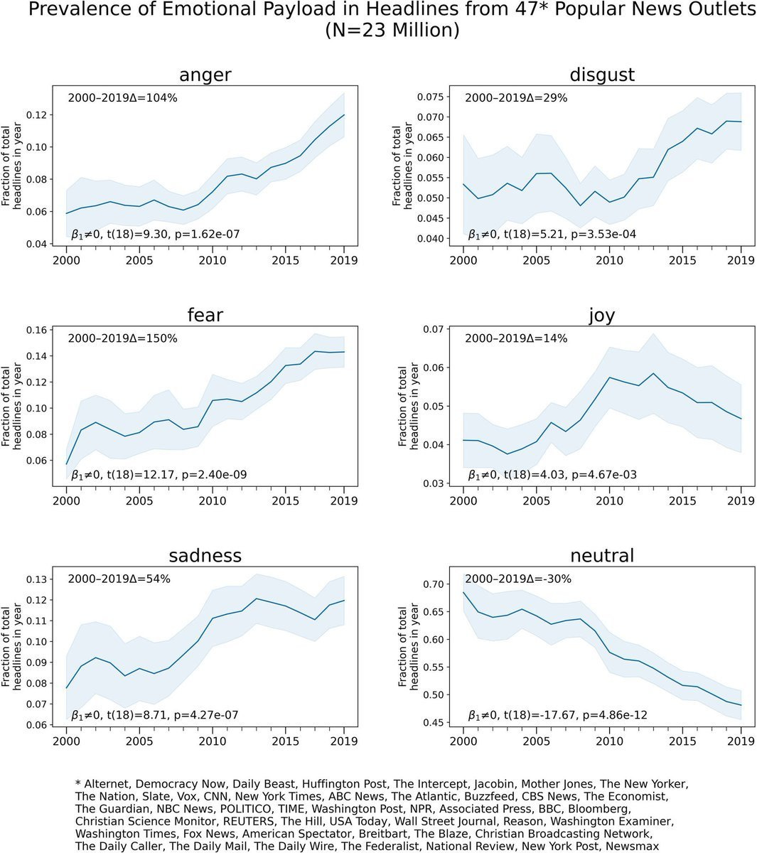
It is evident that the ‘negative’ attributes are on the rise and virtues like neutrality and joy are on the fall.
But this newsletter is not just a rant. It comes with an idea. An idea I am very bullish about --Data Visualisation (called dataviz too). Imagine a space where information is not just processed data but visually appealing, attention-pulling, and intuitively explorative. Something that you want to keep scrolling to not merely consume information but to immerse yourself in something that is tastefully curated and designed. The ‘shock and awe’ from dataviz can and must replace the ‘shock and awe’ from negative news.
Data visualisation with narrative context becomes more memorable and relatable. It is making news more aesthetic while maintaining the integrity of the content. Audience retention is preserved. Ad revenues are sustained. It is appealing, ethical and, most importantly, it is healthier.
Here are some news organisations that have been producing very high-quality data narratives. I have selected my favorite essays from their websites, do give them a read and see for yourself the ‘shock and awe’ that arises with good dataviz.
Kontinentalist: An Asia-focused media house with creative storytelling and out-of-the-world website experience. This is one of their essays that made me more aware of Singapore’s land reclamation initiatives.
538: Launched by the legendary statistician forecaster Nate Silver, this publication focuses on politics, sports and general news. Look at both sides of America’s biggest debate with informational informatives: Daylight Savings Time!
https://projects.fivethirtyeight.com/daylight-saving-time/
Drop a like if you liked the idea and the curated content!