
Trail Mix - Mountains, maps, and metrics
A data-fueled journey through America’s national parks

My family was visiting the US just as I finished my master’s degree. Since they were coming for a very short time, I wanted them to see parts of the country they had never experienced before.
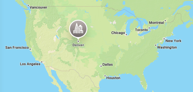
Whenever I travel in the US, my cheap tickets usually come with a complimentary layover in some random city. One of these cities was Denver, CO. The airport is beautiful and you can see the lovely snow-capped Rocky Mountains all around you. Wandering through the terminal, admiring the peaks and looking for cheap snacks in vending machines, I knew I wanted to come back here again—this time to actually hike and trek the Rockies.
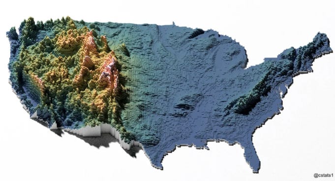
I also love compulsively staring at the flight map while traveling. And in doing that, I discovered something fascinating about American topography: most of the eastern part of the country is really flat! I live in Chicago and can confirm—there are no meaningful gradients around me, just endless flatland. The central part of America where the mountainous region starts (officially called the Intermountain West) begins in Colorado and a few other states. And guess where Denver is?
While in Denver, I visited Rocky Mountain National Park. Driving around, hiking, and camping in a national park is absolutely magical. Meeting the park rangers was such a highlight; they pull out a giant A1-sized map, ask you what you're into, and then circle a few trails to explore. With no network and nothing but a physical map to guide you, you truly feel like an explorer.
Mesmerized by this experience, I decided to make visiting national parks my travel theme for the year. And the data nerd in me couldn’t resist digging into these natural gems through data. This newsletter is the result! It’s a listicle, a travel guide, and a data narrative, all packed into one.
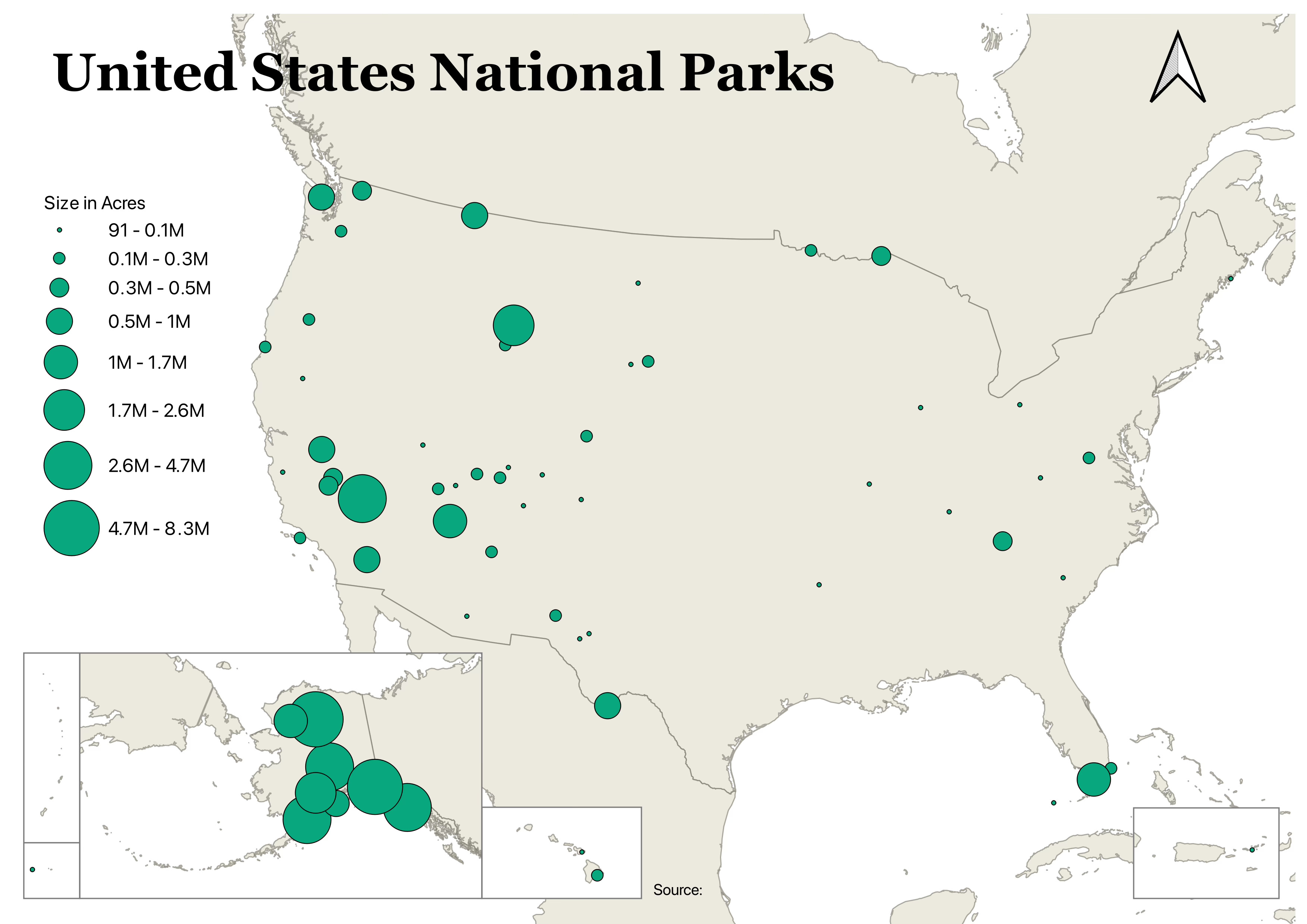
Let’s start with a map of all national parks in the US, scaled by size. I made this in QGIS which is one of the most fun tools for mapping. It doesn’t require coding; it’s mostly clicking, formatting, and layering. Think of it as a complex version of MS Paint meets Excel. You can already see a pattern if you compare this map to the topographical one: most of the larger parks are in the Intermountain West. And what’s going on in Alaska? Into the Wild much?
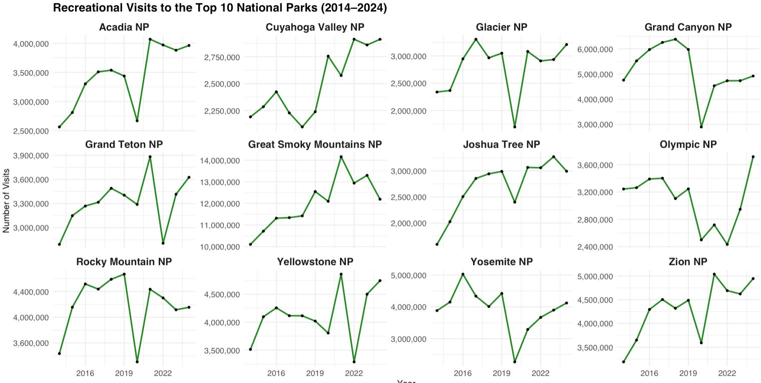
Next, I explored the most popular national parks and how their visitations have changed over the past decade (2014–2024). Many saw steady growth until COVID-19 hit. Some iconic parks like Yosemite and the Grand Canyon still haven’t returned to pre-COVID levels. But others have exploded in popularity post-pandemic—Great Smoky Mountains, Olympic National Park, Acadia, Zion.
Looking back at the first map, the variation in park size is striking. It made me wonder: does size correlate with popularity? The bigger the park, the more nature it offers; mountains, valleys, waterfalls. Surely that would mean more visitors?
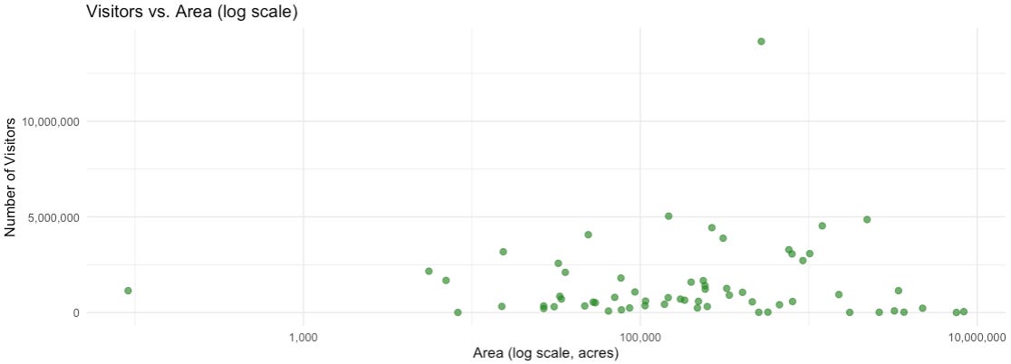
Surprisingly, not really. But before we get into the results, a quick note on log transformation. You’ll notice that the x-axis of the scatter plot isn’t linear. The space between 1,000 and 100,000 is the same as the space between 100,000 and 10,000,000. This compresses the scale when there's a wide range of values, making patterns easier to spot without being skewed by massive outliers.
Coming back to the main point: there’s no meaningful association between park size and visitations. Instead, it seems proximity to densely populated areas is a far bigger driver. Take that dot way up there—Great Smoky Mountains National Park. It's nestled in the Appalachian region, close to the Tri-state area, Atlanta, and North Florida—basically the entire East Coast is within driving distance.
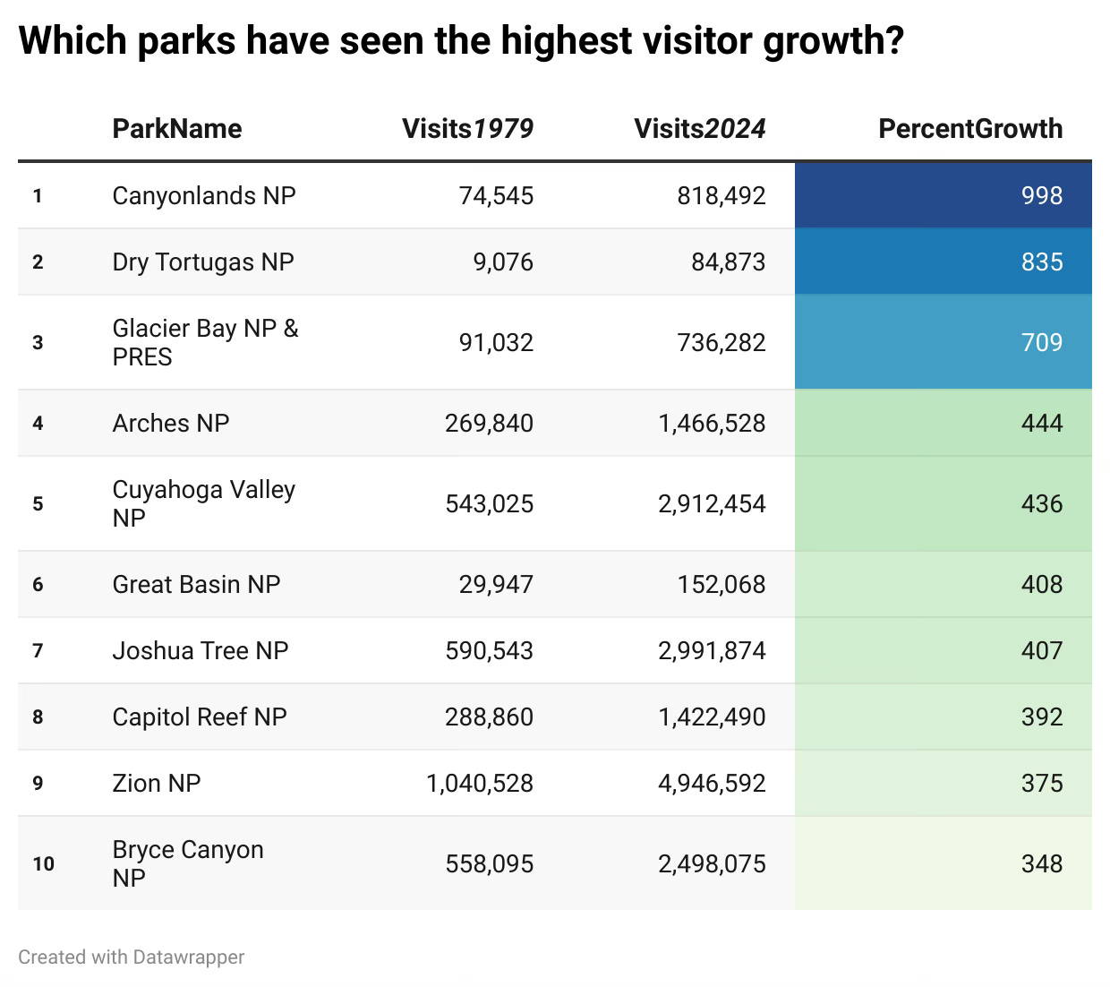
Now, let's see the National Parks which have the highest percentage growth in visitations (from 1979 to 2024). The percentage is a good way to describe this change, But we need to be cautious here: this kind of analysis is prone to low base bias. A park that had very few visitors in 1979 might show a huge percentage jump even if the absolute increase is modest. So while the growth rate tells a compelling story, it’s important to pair it with context i.e. where the park started and where it is now. The ones which are in bold such as Arches, Joshua Tree, Zion had a high enough number of visitors in 1979 and also achieved a high growth in visitors.
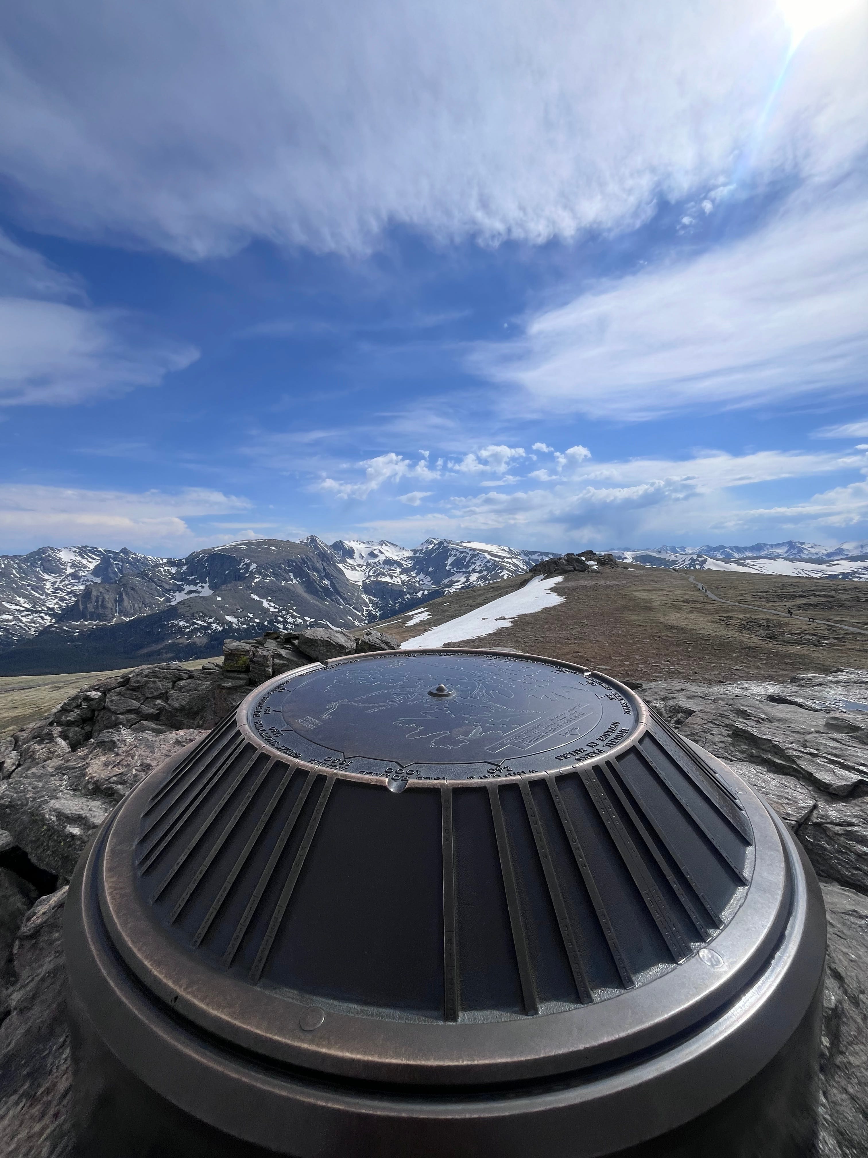
In the end, national parks reflect not just natural beauty, but geography, demographics, and even economics. Here is a bonus picture of my favorite hike in the Rockies.
Until next time.