
Data (audio)visualization - The sound of Data
How data can now be sonified to create engaging forms of storytelling and information design

My relationship with data began as early as middle school. I remember a computer class where the teacher explained the difference between data and information. Information is data processed and presented in a comprehensible way with meaning. But information in itself is incomplete too. We want information to interact with our senses. Data visualization is an example of this. It adds a layer of visual appeal to information.
But It isn't just our visual senses that data can interact with. Data sonification (interaction of data with audio) is becoming popular, but many people still need to learn about it. It is a method where you can convert data points into relevant notes and play them like music. Sometimes, you may not need to convert them into sound notes; even a plain recording might do the trick!
For example, Figure 1 below shows noise pollution in decibels before and after the pandemic. The chart on the left adequately explains the noise pollution drop, but there is nothing sensory about it. A better way to explain this is to embed actual sound recordings before the pandemic and during the lockdown, like how the New York Times did it (see Figure 2).
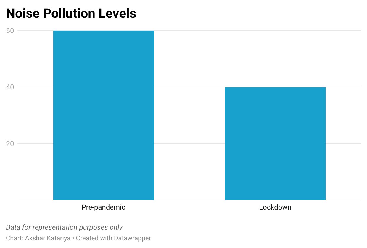

Figure 2 is not just a picture of the sound waves, but are actual buttons which play street recording noises. Click on the picture to be redirected to the New York Times where these recordings can be accessed.
The previous example was not entirely data sonification; the data source itself was sound. Let's look at an example where numeric data is converted into sound. The chart below shows the approval ratings of President Richard Nixon until his dramatic resignation from the presidency.
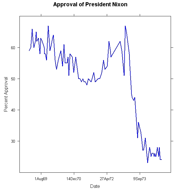
Brian Chirls of Datavized has converted this graph into music by using 'The Legends of Zelda's soundtrack to annotate the various phases of his presidency. Legends of Zelda is a game franchise with a very recognizable soundtrack. He used that soundtrack to map increases in approval ratings to sounds of ‘swords clashing’. ‘Hurt grunts’ were mapped to drops in approval ratings. In this way, movements in the graph were appropriately mapped to relevant sounds, which gives the listener an audiovisual sense of the presidency. Play the recording below to get a sense of this project.
Why Data Sonification?
Inclusion of visually impaired people: Visual representation excludes people with visual impairment. Although there are accessibility tools like image descriptions, they fails to evoke memorability. A good graph's point is to deliver data and foster long-term engagement with it. Data sonification includes people with visual impairments and delivers information with the same punch.
Higher Engagement: In this world filled to the brim with information and lowering attention spans, retaining the reader’s attention is paramount. The information must be concise, comprehensible and relatable. In that, data sonification can help people engage with an alternate mode of perception. The impact that audio data can have in evoking intuitive senses cannot be replicated by visual representation of information.
Better storytelling: Adding an audiovisual medium to data can also make us more effective storytellers. Stories which stimulate our senses stay with us. They speak vividly of the scene, making us feel, touch, and experience the setup. This scene allows readers to connect with the story on an emotional and empathetic level. Having audio-based tools can facilitate the creation of such scenes.
To learn more about how you can sonify data from scratch, visit twotone.io
Insightful read, NASA and climate research labs use this ig, hope I can integrate sonification and visualisation into a real-time project!
Lovely piece! Very insightful!